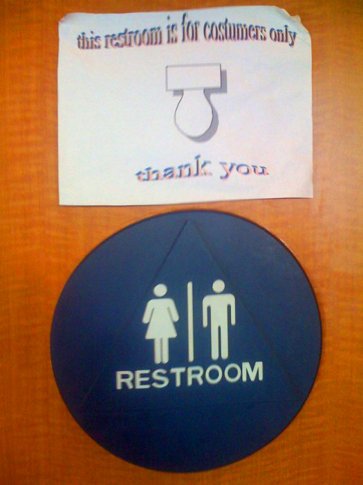
Located at Lankershim and Oxnard in North Hollywood, CA.
I love that the person who made this sign was so into it that they used two-tone wavy text and added a toilet graphic, complete with drop shadow. I should have asked who made it, but I didn’t want them to change it.
Also the misspelling that it is for “costumers” only! Does that mean it’s only for costume changes?
They make sure it’s for customers/costumers only as an employee needs to unlock the door for you.(I should have gotten a pic of the combination lock on the door.) But if you’re eating at Taco Bell, you’re surely going to need to use the restroom soon.







Allee Willis
I always love the personal touch in homemade signs, especially as you would think that a place like Taco Bell would have standard issue ones for all of its stores. I like that the designer, probably the cashier or window person or one of the manager’s kids, put the effort into the wavy, shadowed text.
Seeing the toilet from the top view looking like a giant pacifier pointing to the restroom sign is an excellent kitsch touch. The last place you would want a baby pacifier to be associated with would be the bathroom of a Taco bell.
Another really nice touch is how the paper it’s printed on is curling up in the top corners. I can’t imagine this does much good vis-a-vis the psychological impact it has on the customer. And I’m pretty sure this isn’t a sliding door so how did corners that high up get crinkled up like that in the first place?
Records search
A two thumbs up to this post. Maybe the one responsible in creating the Post for the comfort room is the manager, Like what Allee said the post has its psychological idea of creation.
michaelmishaw
Maybe the grease in the air inside the restaurant made the corners of the sign curl up.