


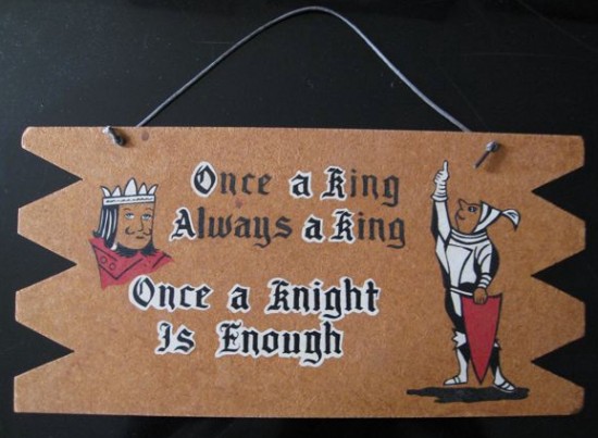
I suspect this corny vintage sign (which was probably considered risque at one time) was made from a kit. On the back of the board is stamped, “Colors in Oil by WESTERN ARTCRAFT / P.O. Box 266 / HAWTHORNE, CALIFORNIA.” The graphic design is off (“Once a King…” is centered but “Once a Knight…” isn’t), the two lines at the bottom are outlined in white but the two at the top aren’t, and the sawed board isn’t symmetrical. I guess this was marketed for 50’s housewives to place over their beds to stave off their horny 50’s husbands.


Allee Willis
The more homemade for me the better!
Also, the ‘a’ between ‘Always’ and ‘king’ is crooked and not centered. The ‘a’ above it isn’t centered right between the two words on either side of it either. And all four corners are different. And the king is perched much too close to “Once a knight”.
I also really like that on the back it says ‘Colors in oil’. What colors? Oils wouldn’t do very well on this kind of board anyway.
I have a lot of bedroom signs but none like this. Most of mine are the love meter type where you spin the arrow to see if you’re going to have sex or a headache.
This is spectacularly bad.
denny
I’ve always loved these wooden “message signs” and grew up with the infamous one with the family of dogs. I would love to know what the pone figure is pointing to? Good one Doug!